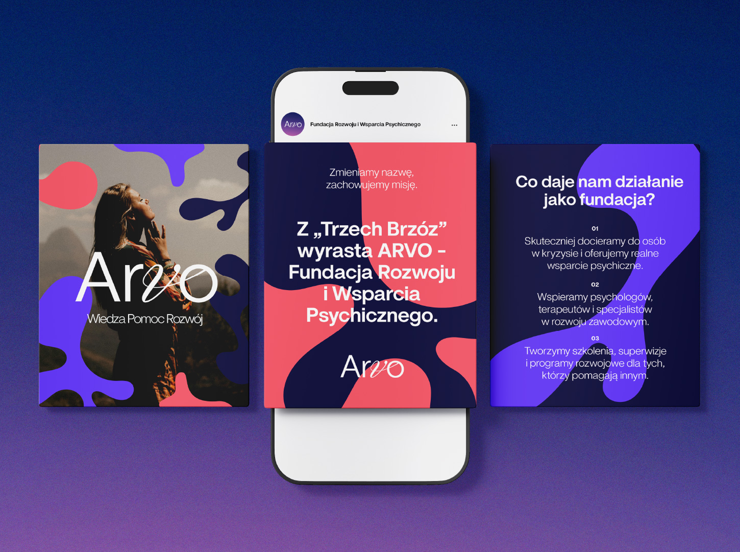
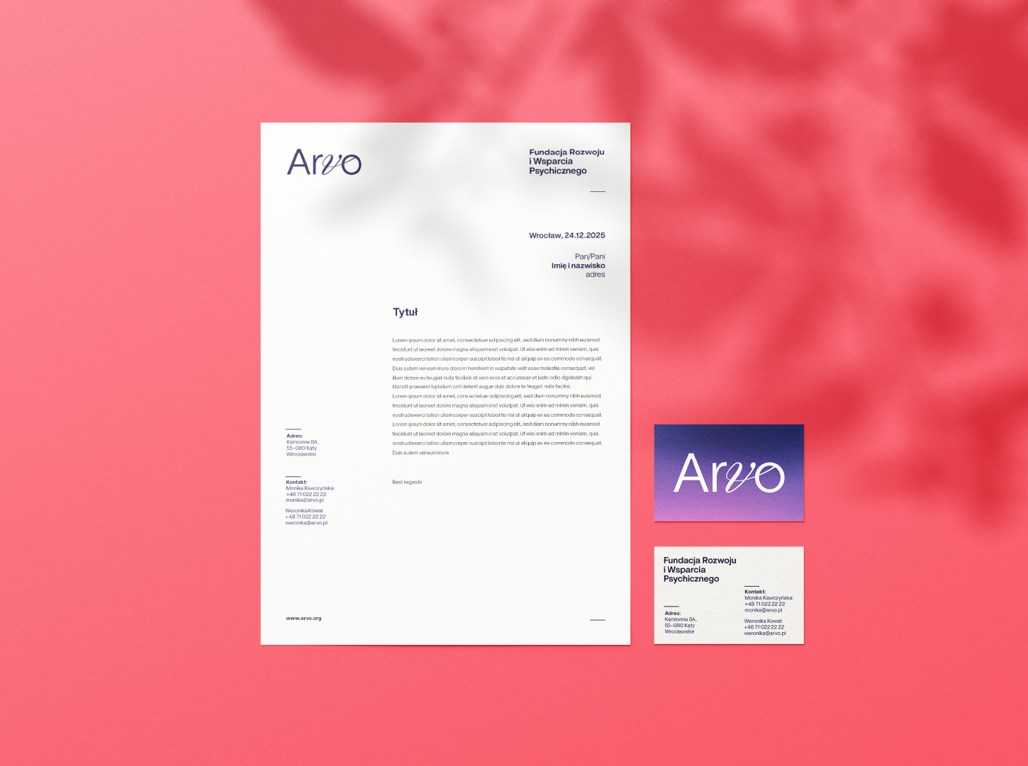
Arvo
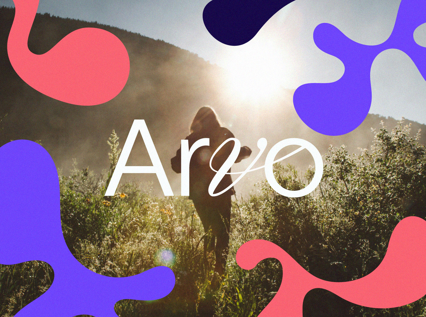
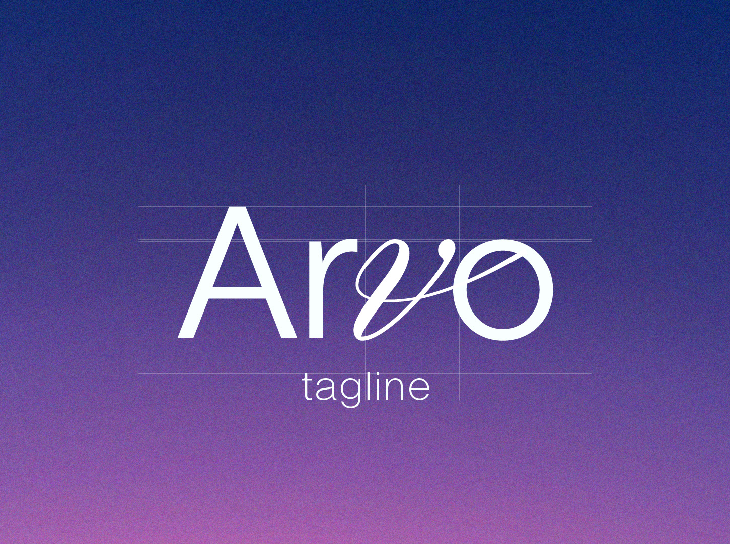
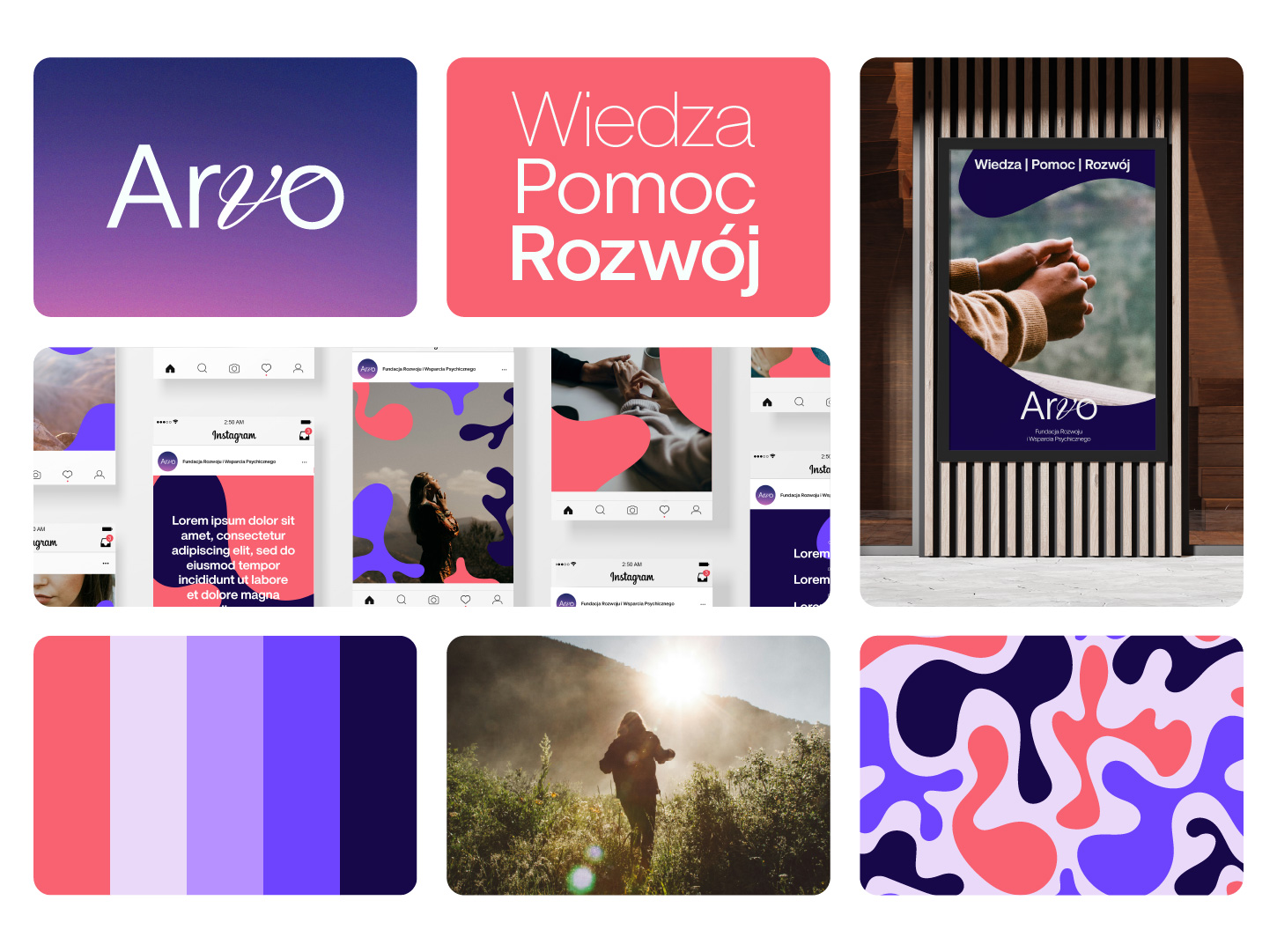
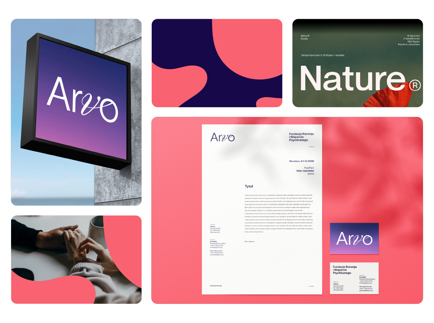
Visual identity for Arvo – a foundation focused on prevention and support in mental-health crises. The brief called for a typographic, modern logotype that avoids hugging symbols and refers to the origin of the name itself. In Finnish, „arvo” means “value” – a concept that is ethically strong yet emotionally neutral. The colours were meant to feel uplifting, avoid pastels, and stand out among similar identities.
—
I embedded the letter “v” into a simple, minimal typographic structure, introducing a subtle human gesture – an element of empathy and connection. This creates a form that bridges two dimensions: the rational and the emotional.
The mark remains calm and balanced, inspires trust, and avoids excessive softness. Its character is meant to convey presence and attentiveness while maintaining a sense of order and professionalism.